
- Home
- Services
Our ServicesSEO ServicesOptimize your rankings & visibilityPPC ServicesDrive targeted traffic with adsWeb Design ServicesBeautiful, responsive websitesSocial Media ServicesGrow your brand presenceEmail Marketing ServicesEngage customers directlyNeed help choosing the right service?Talk to Sales
- Blogs


TL;DR
- This is for performance marketers, brand managers, and agency teams running paid ads on Meta, Instagram, or any social platform. This blog gives you a sharp creative checklist you can use before approving any ad.
- Meta’s own research shows creativity drives 56% of a campaign’s ROI more than targeting or budget combined, yet most teams spend the majority of their time elsewhere.
- Great ad creatives follow a consistent set of principles: a strong hook in the first 1.5 seconds, one single message per creative, and mobile first design baked in from start.
- Real-life visuals, burned-in subtitles, and a single clear CTA are often the difference between an ad that converts and one that disappears into the feed.
- Before approving any creative, run the “11 PM scroll test” if you wouldn’t stop for it yourself, it is not ready to go live.
Table of Contents
Most ads fail not because of bad targeting or low budgets but because creative itself is weak. This blog covers 9 non-negotiable rules for ad creatives that help you stop scrolling, hold attention, and drive real clicks starting with the very first frame.
Thank you for reading this post, don't forget to subscribe!In 2026, creativity influences over half of a campaign’s return on investment, according to Meta’s own data. Google puts the number even higher, up to 70% of a campaign’s success tied directly to creative quality. Yet most marketing teams spend 80% of their time split-testing audiences and adjusting budgets, while creative barely gets a second look before going live.
That’s a gap, and it’s where most ad spend quietly bleeds out.
Whether you run paid ads in house or manage them for clients, these 9 rules for ad creatives will give you a sharper filter, one you can apply before anything goes live.
Related Blogs:
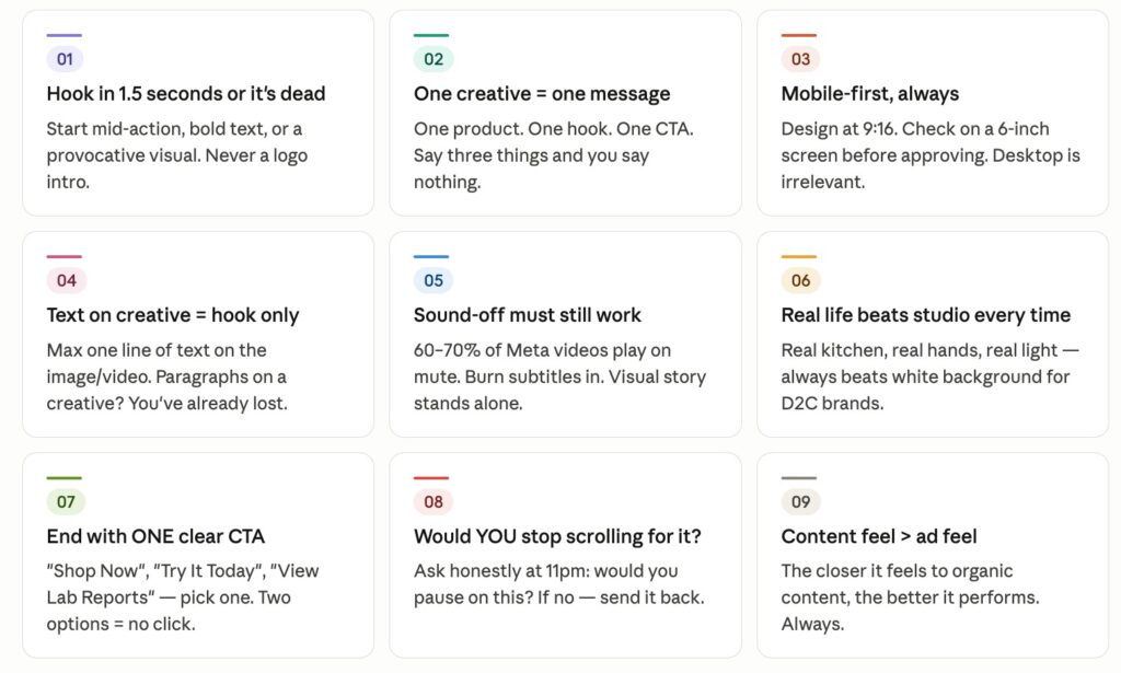
Rule 1: Hook in 1.5 Seconds or It’s Already Dead
Scroll doesn’t wait. On Meta and Instagram Reels, you have roughly one to one and a half seconds before a user’s thumb moves past your ad. That first frame or first second of the video is doing all the heavy lifting.
Biggest creative mistake? Starting with a logo, a brand name, or a slow pan. That’s what TV ads do. Social feeds are built differently. Start mid action. Show problem. Throw a provocative visual or a bold text overlay right at top. Make the viewer feel like they’ve interrupted something, not sat down for a commercial.
Think of it this way if someone could screenshot your first frame and not know it was an ad, you’re on the right track.
Rule 2: One Creative, One Message
This one gets ignored constantly. A brand wants to show three products, highlight two offers, and squeeze in a brand story all in one ad. The result is a creative that says nothing to anyone.
Rules for ad creatives are built around simplicity for a reason. The human brain under scroll fatigue doesn’t parse complexity. It responds to clarity. One product. One hook. One reason to care. One call to action.
The moment you try to say three things, the viewer registers zero. Treat every creative as if it has room for exactly one idea, and build from there.
Rule 3: Design for Mobile First Not Mobile Last
If you’re designing on a desktop, exporting to desktop dimensions, and then checking how it looks on your phone as a final step, you’re doing it backwards.
Over 70% of digital ad spend globally is consumed on mobile, and in India, that number is even higher given how most internet users access platforms via smartphones. Design your creative at 9:16 from start. Check text size on a 6 inch screen before signing off. Make sure the key visual isn’t cut off by platform UI elements at top or bottom.
Desktop is an afterthought. Mobile first rules for ad creatives are not optional in 2026 they’re survival.
Rule 4: Text on Creative Is for Hook Only
If you have a paragraph of text sitting on your creative explaining features, listing specs, or writing out offers, you’ve already lost the viewer. Visuals are meant to earn attention. copy in ad body or caption does explaining.
The only exception to this rule is when text itself is hooked. Think bold, short phrases like “You’re probably making this mistake” or “Your skin deserves better than this.” One line that stops scroll. Anything beyond that and you’re cluttering a visual that was supposed to do all talking.
Rule 5: Sound Off Must Still Work
This is one of the most underused rules for ad creatives in India, where video ads run heavily on Instagram and Facebook feeds. Between 60% and 70% of Meta video ads are watched without sound, especially in public spaces and office environments.
Your creative needs to tell its entire story visually. If the hook, product, and CTA only make sense with audio, you’ve built a creative that silently fails for the majority of your audience.
The fix is simple: burn subtitles into video. Not auto generated captions added later, but subtitles that are designed, readable, and timed to visuals.
Rule 6: Real Life Beats Studio Every Time
This is especially true for D2C food, health, and lifestyle brands in India. A product shot on a white background looks like a product listing, not a recommendation. A product shown in a real kitchen, held by real hands, in natural light that looks like content. And the closer an ad looks to content, the better it performs.
Meta’s algorithm rewards creativity that earns organic engagement alongside paid reach. Real life visuals are more likely to get comments, saves, and shares. They build credibility faster than any studio shoot. A user who sees your chutney being spooned out of a jar on someone’s kitchen counter connects differently than someone who sees the same jar against a clean white backdrop.
Authenticity reads. Especially on mobile, and especially in the Indian market where regional trust plays a significant role in purchase decisions.
Rule 7: A/B Test Creatives Systematically, Not Randomly
Most teams run A/B tests when something breaks, not as a standard operating procedure. That’s backwards.
The right approach to rules for ad creatives includes building a testing habit from day one. Change one variable at a time hook, CTA, visual style, or first line of body copy. Track which version drops cost per result, then iterate on the winner. Randomly launching three creatives and picking the best performer without understanding why it won teaches you nothing useful for the next campaign.
Rule 8: End with One Clear CTA Never Two
“Shop Now” or “Learn More”? Pick one.
Giving a viewer two options at the end of an ad is not helpful, it is paralyzing. Decision fatigue is real. When you ask someone to choose between two actions, the easiest choice is neither.
Your CTA should match the temperature of the audience. Cold audience seeing your brand for the first time? Use “Learn More” or “Explore Now.” Retargeting someone who visited your product page? Go with “Shop Now” or “Buy Today.” But in both cases, only one CTA, placed once, with no competing link or offer diluting it.
clearer instruction, higher click through rate. Rules for ad creatives exist precisely to remove confusion from the viewer’s path.
Rule 9: If You Wouldn’t Stop Scrolling for It, Nobody Will
This is the final filter and it is the most honest one.
Before any creative gets approved, someone on the team should open Instagram or Facebook at 11 PM, in passive scroll mode, and mentally ask: would I stop for this? Not “is this well designed?” or “does this cover all points?” Just would you actually pause?
If the answer is no, send it back.
The second question is equally useful: does this feel like content or does it feel like an ad? closer it feels to content something a friend might post, something informative, something that earns its place in the feed better it performs. Ads that feel like ads remind people they are being sold to. Content that also happens to be an ad converts.
Conclusion
Most ad creative failures have nothing to do with budget and everything to do with judgment. These 9 rules for ad creatives give your team a shared filter, a checklist that keeps hook sharp, message focused, and approval process honest.
fundamentals have not changed: stop scroll, communicate one clear idea, and make it easy to act. What has changed is the speed at which bad creative gets punished and bars for what “good” looks like in a mobile first, sound off, real content world.
Start applying these rules before your next creative goes live. Review your existing live ads against this list.
FAQs
Q: What is the most important rule for ad creatives in 2026?
The hook comes first. If your creativity doesn’t stop scrolling within 1.5 seconds, none of the other rules matter. Most rules for ad creatives exist to support that first moment of attention; everything else is retention and conversion.
Q: How many CTAs should an ad creative have?
Exactly one. A second CTA creates decision fatigue and drives down click through rates. Choose a CTA that fits your audience’s stage in a funnel and stick with it.
Q: Why do real life visuals outperform studio shots for D2C brands?
Because they feel like content rather than advertising. Audiences, especially in India, connect with authenticity. A product shown in a real setting builds trust faster than a perfectly lit product shot on a white background.
Q: How do I know if my ad creative is ready to go live?
Run 11 PM scroll test. View it on your phone, in a real scroll session, and ask honestly whether you would stop for it. If the answer is no, creativity needs more work before going live.
